Creative Management
Application

Imagitas / Pitney Bowes · 2008–2009

Replacing a hybrid paper-and-digital advertising workflow with a unified digital platform — tracking creative assets from sale to publication for a company managing print and online ad campaigns across hundreds of local clients.

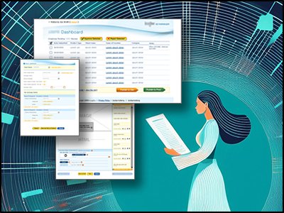
Creative Management Tool — Sales Agreements Dashboard · Imagitas

Project Snapshot

The Problem
An advertising company managing print and digital campaigns for hundreds of local clients was running its entire creative workflow through paper forms, physical file cabinets, and disconnected digital tools — a slow, error-prone process that had outgrown itself.
My Goal
Design a unified digital platform to replace the hybrid paper-and-digital process — tracking creative assets from sale through publication while guiding nine technical and non-technical stakeholders through a full user-centered design process.
The Team & Mandate
Nine stakeholders across five user roles: Ad Manager, Creative Director, Designers, Sales, and external Clients. I led all UX and facilitated the full design process from discovery through handoff to an offshore development team.
  • Track every creative asset from initial sale through client approval and publication in one system
  • Eliminate paper-based hand-offs and physical file storage entirely
  • Support distinct workflows for five user roles without overcomplicating the interface
  • Reduce steps for core tasks by more than 50% compared to the existing process
  • Build stakeholder alignment across nine participants using a structured UCD process
Outcomes

Delivered a complete application design covering sales agreements, campaign management, asset tracking, approvals, and admin. The redesigned process eliminated all physical hand-offs and set the foundation for an offshore development build.

>50%
Reduction in steps for core tasks vs the original hybrid process
Process diagram comparison — before vs after
9
Stakeholders aligned across technical and non-technical disciplines
Ad Manager, Creative Director, Sales, IT, Offshore Dev, and more
0
Paper hand-offs required in the redesigned process
All physical sneakernet steps eliminated
Killer Feature

Process Map as a Design Tool — With five distinct user roles and no shared mental model of the process, I created a detailed current-state process map as the first deliverable — making the pain visible to everyone in the room at once and creating immediate stakeholder alignment on what needed to change.

Design Process
Process Mapping
Task Screens
Sketches
Wireframes
Wireflows
System Map
Visual Design
My Role
Lead UX Designer
Company
Imagitas / Pitney Bowes
Timeline
2008–2009
Platform
Internal Web App
Team
Solo UX + 9 Stakeholders

Research & Insights

I started by tracking the lifecycle of a creative set from inception to client approval — interviewing internal users across every role involved in the process and reviewing the current digital system. The goal was to document every step, both online and offline, before redesigning anything.

Five distinct user roles shaped the system design, each with different needs, permissions, and workflows. Understanding how these roles interacted — and where handoffs between them broke down — was the foundation for every design decision that followed.

Sneakernet Was a Real Problem
Staff were physically walking paperwork between departments. This wasn't a metaphor — it was the actual process. Every walk was a delay, and every handoff was a potential point of failure with no digital record.
Nine Stakeholders, One Vision
The stakeholder group spanned Ad Managers, Creative Directors, Sales, IT, and offshore Development. Wireflows and structured UCD sessions were the tools for building shared understanding and getting alignment across such a diverse group.
Task Screens Revealed Hidden Complexity
By mapping each screen's requirements and color-coding them by process type (creative, system, admin), I could show stakeholders exactly what each interface had to support — making scope tangible before a single wireframe was drawn.
Everything Connected to Everything
Sales agreements linked to campaigns, campaigns to creative assets, creatives to zone pickers and template selections, and all of it to client approval workflows. The system map became essential for communicating scope to leadership and developers.

Sketches and Task Screens

Sketches

Before any digital wireframing, I worked through the interface on paper — exploring layout ideas quickly without committing to tooling.

Task Screens

I created task screens as a structured mapping of each screen's requirements, colour-coded by process type (creative, system, admin), to make sure every wireframe was grounded in what it actually needed to do.

Wireflows

Wireflows mapped the full interaction sequences for the application's primary use cases — showing how each user role moved through the system from start to finish.

System Map

The system map gave leadership and the offshore development team a complete view of the application's scope — all screens, connections, and role-based access at a glance.

Design Decisions

The design documentation was grounded in user tasks from the start. Rather than designing pages, I designed around jobs-to-be-done — what does each role need to accomplish, and what does the system need to support for that to happen? This task-first approach shaped every architectural decision.

01
Four-Section Navigation Matching Business Workflow
The top-level navigation — Campaigns, Sales Agreements, Creatives, Approvals — directly mirrored the advertising lifecycle. Users could orient immediately because the structure matched how they already thought about their work.
02
Client List + Detail Panel Layout
A persistent client list on the left with a contextual detail panel on the right gave Ad Managers fast access across clients without losing context. This two-panel pattern appeared consistently across all major sections, reducing the learning curve for switching between workflows.
03
Creative Builder Wizard for Complex Asset Setup
Setting up a creative asset involved multiple interdependent choices — template selection, zone picker, product components, and approval routing. Rather than a free-form form, I designed a step-by-step creative builder flow that guided users through the process in the right order, preventing errors before they occurred.
04
Role-Based Access Across Five User Types
Each role — Ad Manager, Creative Director, Designer, Sales, Client — saw a different interface with different permissions. Clients got a lightweight approval-only view. Internal users got full workflow management. This prevented confusion and reduced the risk of users taking actions outside their role.
05
Wireflows to Align 9 Stakeholders Before Development
With an offshore development team, getting alignment before coding began was critical. Wireflows — screen thumbnails arranged in user flows — gave stakeholders a concrete, reviewable picture of how the system worked without requiring them to read technical specifications. This reduced late-stage surprises significantly.

Final Designs

The final visual design established the CMT's four-section layout — Campaigns, Sales Agreements, Creatives, Approvals — with a consistent two-panel pattern throughout. The visual design work grounded the system in the company's existing brand while making the dense information architecture as scannable as possible.